In this article series, Lucy Rubin breaks down anime analysis for Around Akiba and shows how we can use it in our everyday anime-watching lives. This time, we will explore style.
Style in Anime: An Introduction
This is the second half of the series of How to Watch Anime Analytically articles. In this half, we will embark on style series divided into three installments. With the first installation, I will be discussing the basics of film style concerning color. The second installation will cover character design, and the third installment will look at the individual shot, as well as space, movement, and composition. Stylistic shifts and deformations will appear in the fourth installment.
What is style?
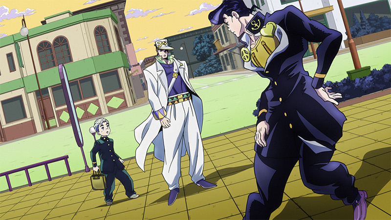
So now that we have discussed the different aspects of narrative style let’s go into the second part of the basics of film analysis: style.
This may sound like a very general term… ~style~ but in practice, it is a very flexible term. Film style is the selection and arrangement of different visual elements that all contribute to how we, the audience, make sense of and are emotionally invested in a work of film. Think back to when we discussed narrative and our understanding of how a story is put together. Style, then, is the way in which we interpret this story through the visual medium. It is also how the choices made involving what we see on the screen influence our understanding of a story.
I could go on indefinitely about the different elements that make up film style – heck scholars much more educated than me write books about this that aren’t even inclusive of everything that makes up film style. That being the case, for this intro to anime analysis series, I’ll be going in-depth on what the most salient aspects especially when discussing style in anime analysis specifically. For example, we will be skipping discussion of aspect ratio because most anime that we are watching are made for TV, they are almost all made in the 16:9 standard widescreen format. While I could discuss the various ways that different filmmakers work within the 16:9 aspect ratio, there are certainly more blatant and anime-specific points of discussion involving film style. So, for this series, we will be looking specifically at color, lighting, and character design.
Stay tuned for the next article about style and color in anime.
