In this article series, Lucy Rubin breaks down anime analysis for Around Akiba and shows how we can use it in our everyday anime-watching lives. This time, we will explore color.
Style: Color in Anime
In anime, unlike in live action film, everything that appears on the screen is a completely constructed world. Everything is deliberate and can be altered and specified to meet very specific needs for telling a story. One of the greatest tools in a creator’s toolbox, in that case, is color. In the beginning production stages of an anime, creators will most often consider a specific color palette that can work to set a specific mood, evoke a certain time period, or just be visually pleasing.
A brief example of this can be seen by comparing the general color palettes of three anime shows by the same director: Shinichiro Watanabe (also giving me general time to gush about how wonderful a director this man is).
Color Through the Eyes of Shinichiro Watanabe
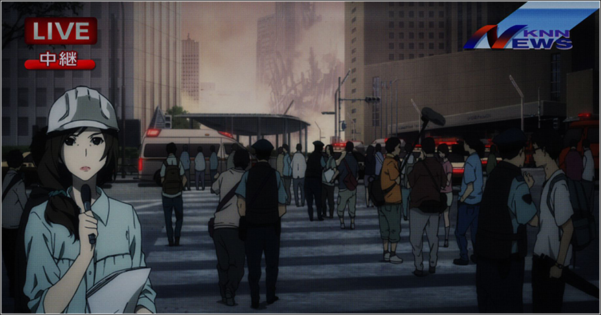
Compare the general palettes of two of his main works: Terror in Resonance and Space Dandy.

Terror in Resonance is an anime that is very grounded in the ‘real’ – presenting an animated world that is evocative of the real world that we live in. It aims to display a gritty, but not foreign atmosphere. as such, displays a color palette that carries that feeling by reflecting the colors that one would see on a normal day, but with a restrained intensity. The palette consists of very muted tones with instances of bright colors being few and far between. Because the show has now set this as the normal color palette, when an explosion (containing bright oranges and reds) happens, or a threatening character (Five, with bright purple eyes) enters, it piques our attention.
In a show revolving around exploding bombs and dealing with the threat of a past friend, these two major elements are highlight through the use of these bright colors that stick out in comparison to the default color palette. In this case, Watanabe utilizes his color choices not just to create the look and feel of his world, but furthermore is able to highlight the most salient and threatening parts of the narrative that he wishes to convey.
Now compare the color palette of Terror in Resonance to Space Dandy. Unlike the more muted Terror in Resonance, vibrant colors abound to create a playful and fast moving atmosphere that carries the comedic and often surrealist tone of the series. Watanabe creates a whimsical atmosphere for the series by establishing a main color palette consisting of striking and saturated non-everyday colors. In this act, he is able to pull the audience out of the colors that they see in their everyday life, and create a space firmly grounded in the unreal. This in turn, is the main vehicle through which he is able to move so seamlessly into the series’ more surreal moments.
These two works, by the same director, which display wildly different color palettes, are an excellent example of how the use of color acts as a powerful tool in a filmmaker’s toolbox to establish tone and highlight major narrative elements. One quick way to consider how a director (or more specifically, a Color Designer… let’s give credit where credit is due… but who definitely works under the director) is to consider how you would feel about a series if it had a wildly different color design, or even if just one small element was changed. Would you immediately know that Five was a potential threat if she did not have bright purple eyes in comparison to all other characters? Would you be able to laugh as much at Space Dandy if it was rendered with the color palette of Terror in Resonance?